

Same Pattern, Three Different Buildings
What a factory floor, a high school, and a software team have in common.

I get asked some version of this question almost every week.
“Does belonging really translate? Our context is different. We are a school. We are a tech company. We are a financial institution. We are a spirits company. We are not a manufacturing plant.”
My research is validated, peer-reviewed, and published. Initially, I started in the mining industry with the largest belonging research study conducted in Canada. In 3 years, I validated that across 8 industries, over 150,000 employees, and built dashboards, tools, skills and competencies in each industry. Based on this data and the continued adoption of this methodology, the research translates, and so will the scoreboards.
Let me show you how, with 3 completely unrelated industries.
The misleading scoreboard
Every organization has a public-facing scoreboard. The numbers leadership reports up. The numbers boards ask about. The numbers that decide who gets promoted.
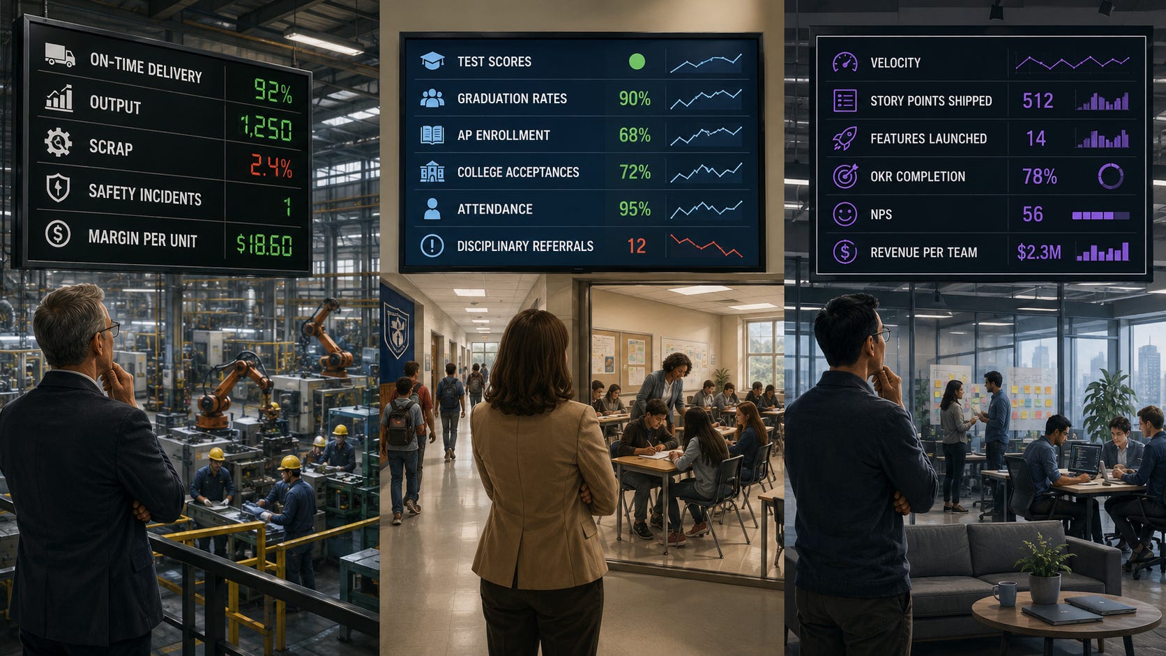
In a manufacturing plant, the scoreboard includes on-time delivery, output, scrap, safety incidents, and margin per unit.
In a high school, the scoreboard is test scores, graduation rates, AP enrollment, college acceptances, attendance, and disciplinary referrals.
In a tech firm, the scoreboard is velocity, story points shipped, features launched, OKR completion, NPS, and revenue per team.
Different language. Different units. Same job. The scoreboard is supposed to tell leadership whether the unit is performing.
The problem is that every one of those numbers can be produced in two completely different ways. One way builds the conditions for the next quarter. The other quietly burns those conditions down. The scoreboard cannot tell the difference. By the time the difference shows up, the leader who extracted has often moved on to a bigger role, and the leader who built is still doing the work.
I call the first kind “extraction performance”. Looks great this quarter. Costs you the next four.
What extraction looks like in each building
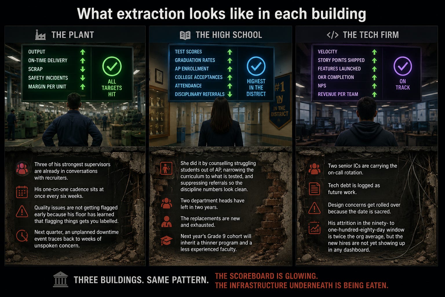
The plant leader hits every number. Output up. On-time delivery up. Scrap down. Three of his strongest supervisors are already in conversations with recruiters. His one-on-one cadence sits at once every six weeks. Quality issues are not getting flagged early because his floor has learned that flagging things gets you labelled. Next quarter, an unplanned downtime event traces back to weeks of unspoken concern.
The principal posts the highest AP scores in the district. She did it by counselling struggling students out of AP, narrowing the curriculum to what is tested, and suppressing referrals so the discipline numbers look clean. Two department heads have left in two years. The replacements are new and exhausted. Next year’s Grade 9 cohort will inherit a thinner program and a less experienced faculty.
The engineering manager ships every launch on time. His velocity is the envy of the org. Two senior ICs are carrying the on-call rotation. Tech debt is logged as future work. Design concerns get rolled over because the date is sacred. His attrition in the ninety-to-one-hundred-eighty-day window is twice the org average, but the new hires are not yet showing up in any dashboard.
Three buildings. Same pattern. The scoreboard is glowing. The infrastructure underneath is being eaten.
The instrument is the same
When I help organizations build what I call a Manager Impact Index, the architecture does not change across industries. The output metrics on the public scoreboard change. The instrument that measures whether leaders are building or extracting does not.
It has three layers.
The first is survey analytics across the five indicators of belonging: comfort, connection, contribution, psychological safety, and wellbeing. Not engagement averages. Indicator-level data, broken out by team, by shift or grade level or function, and by intersection of identity and role. The average always looks fine. The fracture is at the intersections.
The second is open-ended sentiment. The actual language people use to describe what it feels like to work for this leader, attend this school, ship on this team. The patterns in the words matter as much as the scores.
The third is behavioural metrics. Things you can count without asking anyone how they feel. One-on-one cadence. Span of control. Responsiveness to feedback. Time to close raised concerns. Walk-through follow-through. Skip-level frequency. Mid-tenure attrition.
In a plant, the behavioural metrics are about supervisors and operators.
In a school, they are about teachers, department heads, and counsellors.
In a tech firm, they are about engineering managers and ICs. The categories are the same. The instrument is the same.
That is what tells you it is infrastructure.
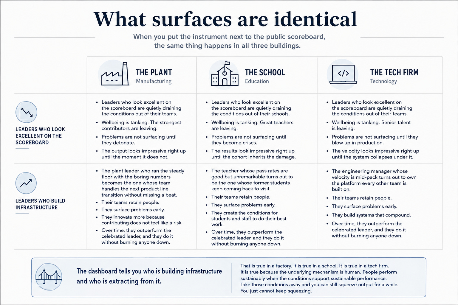
What surfaces are identical
When you put the instrument next to the public scoreboard, the same thing happens in all three buildings.
Some leaders who look excellent on the public scoreboard are quietly draining the conditions out of their teams. Wellbeing is tanking. The strongest contributors are leaving. Problems are not surfacing until they detonate. The output looks impressive right up until the moment it does not.
At the same time, leaders with less flashy quarterly numbers have consistent belonging across all five indicators. Their teams retain people. They surface problems early. They innovate more because contributing does not feel like a risk. Over time, they outperform the celebrated leader, and they do it without burning anyone down.
The plant leader who ran the steady floor with the boring numbers becomes the one whose team handles the next product line transition without missing a beat. The teacher whose pass rates are good but unremarkable turns out to be the one whose former students keep coming back to visit. The engineering manager whose velocity is mid-pack turns out to own the platform every other team is built on.
The dashboard tells you who is building infrastructure and who is extracting from it. That is true in a factory. It is true in a school. It is true in a tech firm. It is true because the underlying mechanism is human. People perform sustainably when the conditions support sustainable performance. Take those conditions away and you can still squeeze output for a while. You just cannot keep squeezing.
The question that has to change
The shift in every one of those buildings is the same.
The implicit question on every leader review moves from “did you produce?” to “did you produce in a way the organization can actually keep paying for?”
In a plant, that means: did you build a floor the next product line can run on.
In a school, that means: did you build a school the next cohort can inherit.
In a tech firm, that means: did you build a team the company can keep shipping with.
Same question. Three different buildings.
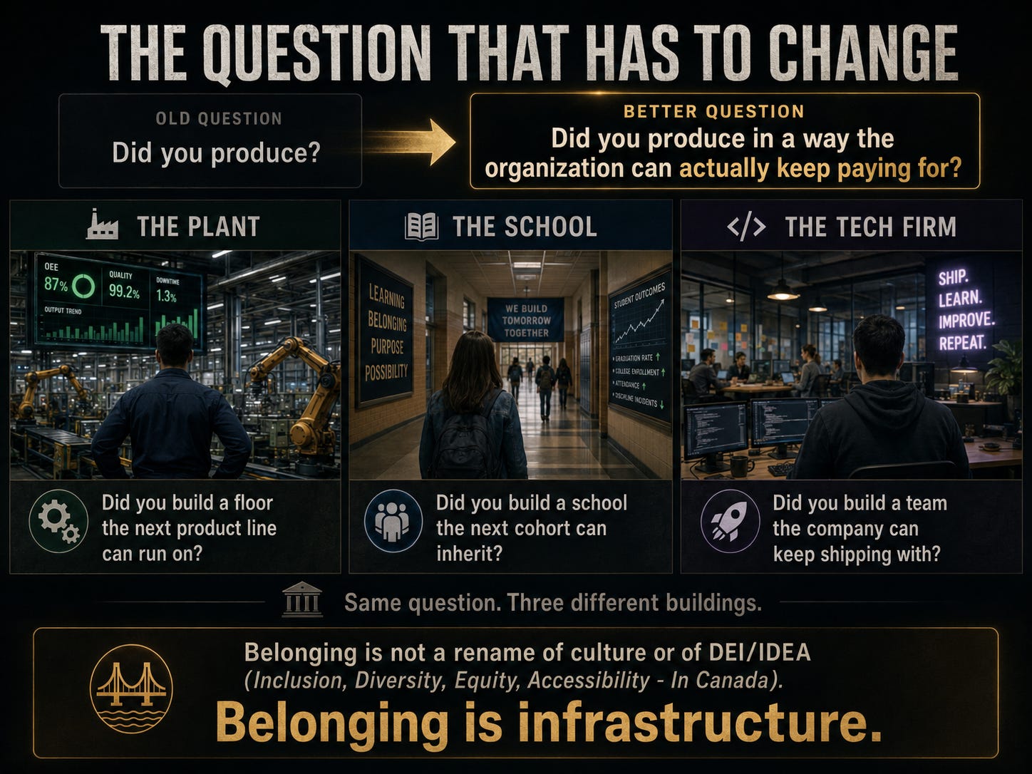
Belonging is not a rename of culture or of DEI/IDEA (Inclusion, Diversity, Equity, Accessibility - In Canada).
Belonging is infrastructure.
The Manager Impact Index is what happens when an organization decides to measure whether that infrastructure is being built or being extracted from.
It is not a manufacturing tool. It is not a tech tool. It is not an education tool.
It is what becomes possible once you stop treating belonging as a culture conversation and start treating it as a performance one.
That is what the conversation in the May 2026 issue of Workforce Alchemy Magazine was actually about. The setting was a manufacturing company and a CFO who needed to understand why this was his problem and not just HR’s. The mechanism is the same in every building you walk into.
The full feature, including the CFO moment that reframed how I talk about belonging as infrastructure, is in the May 2026 issue of Workforce Alchemy Magazine.
Prefer to listen to the podcast? Click Here
If you want to bring this work into your organization through a keynote, executive session, or media conversation, you can connect with me here:
© 2026. Andrea D. Carter. All rights reserved.